
Trykk / Druck / Druk / Imprimer
Learnings from travels to Norway, German, the Netherlands, and France.

I am just getting back stateside from recent travels around Europe (mostly visiting presses, with a few repairs here and there and workshops to bookend the experience), and wanted to share some quick impressions and tidbits picked up along the way. It’s my second time traveling out of the country for riso-related endeavors and it’s always insightful and overwhelming and inspiring to meet so many people and read so many works. And as always I am struck by two things:
How distinct each of our practices are—how uniquely we are each solving parallel challenges and projects in different contexts and to different ends. (And the breadth of ways we can use the same tools and things we can create with them.)
The boundless generosity of this community—our willingness to share our craft and welcome others into our spaces and processes. I experience this most directly in how often I am staying with others and asking for help in my practice and my travels—but I also see it everywhere in how we communicate and collaborate and lean upon each other within our different communities.
I’ve mused on both of those points in many previous posts though, and I want this to be fresh and quick (a piece for writing in airports)1—so instead, I’m just going to go through my notes and list out some of the practical things I picked up over the last many weeks—and a few of the big ideas that have recalibrated a few of the small ideas in my mind.
Travel Discoveries + Observations
These are notes from travels to Bergen, Oslo, and Moss (NO) + Berlin, Hamburg, Leer (DE) + Nijmegen and Amsterdam (NL) + Paris (FR). They get pretty technical—fair warning!
GENERAL PHILOSOPHY + APPROACH
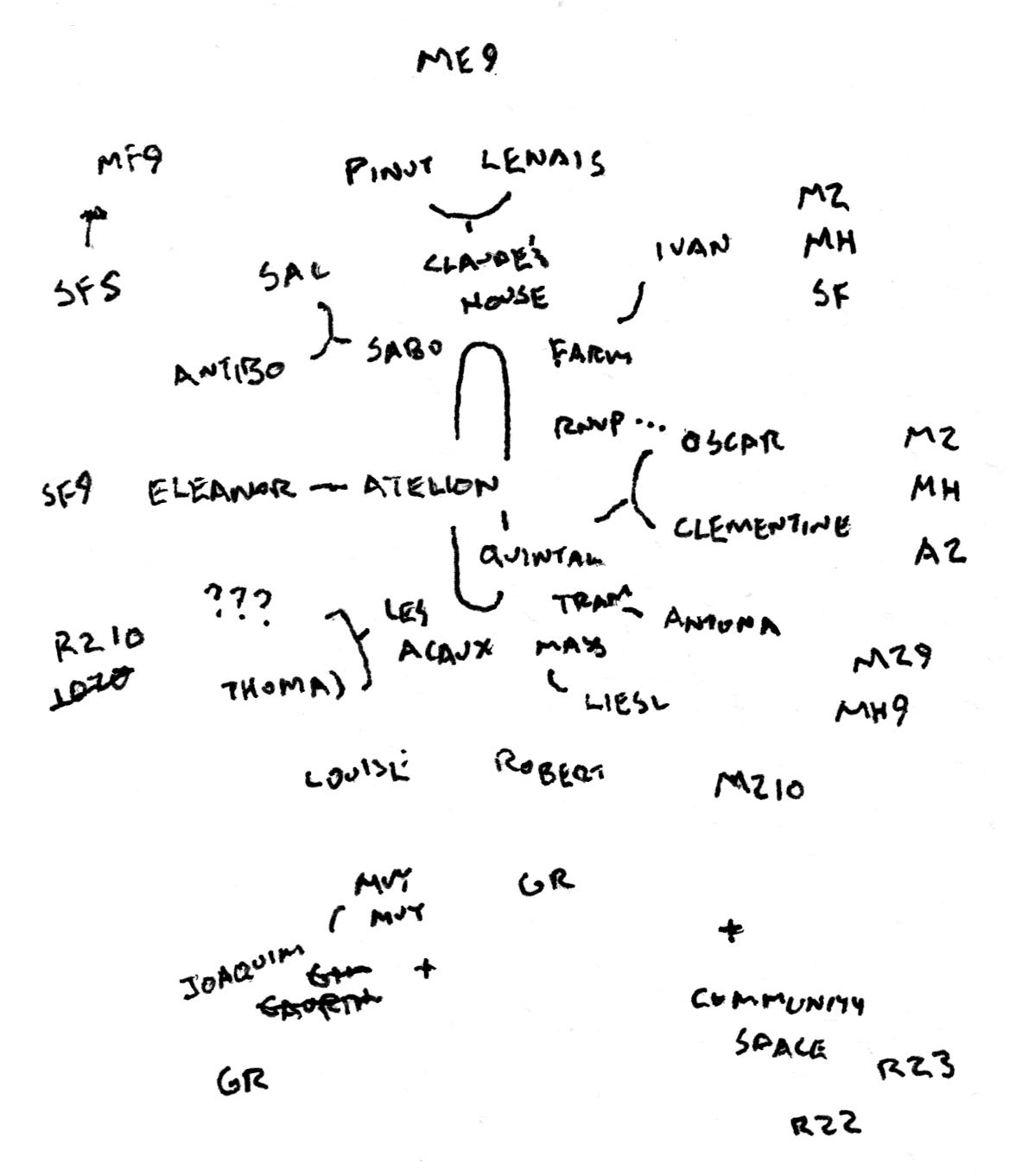
One of the main happenings that brought me across the Atlantic was a gathering of many of the riso presses in France, organized by Quintal (we discussed the prospect of me teaching a workshop at such a gathering when I visited last year—so this visit was the fruition of that plan). During this meetup, the idea of a directory came up—similar to the Riso West Coast, Riso Midwest, and Riso Southeast catalogs published over the last two years in the US, or the Atlas of Modern Risography on stencil.wiki. However Oscar Ginter (who runs Quintal) framed it a little differently in a way that got me thinking about the social space of riso. He believed that the focus of the directory should be on people not places—so instead of listing presses and bookstores and the like, we should be listing people, with the projects they are involved in secondary. A white pages approach, instead of a yellow pages one. This centers the person, the artist, instead of just their business—and makes space for describing shared projects and/or people who work in a lot of different ways. But more than that, it identifies that riso is just one aspect of who are as artists—and that all the other things we do are important context for our publishing practices too.

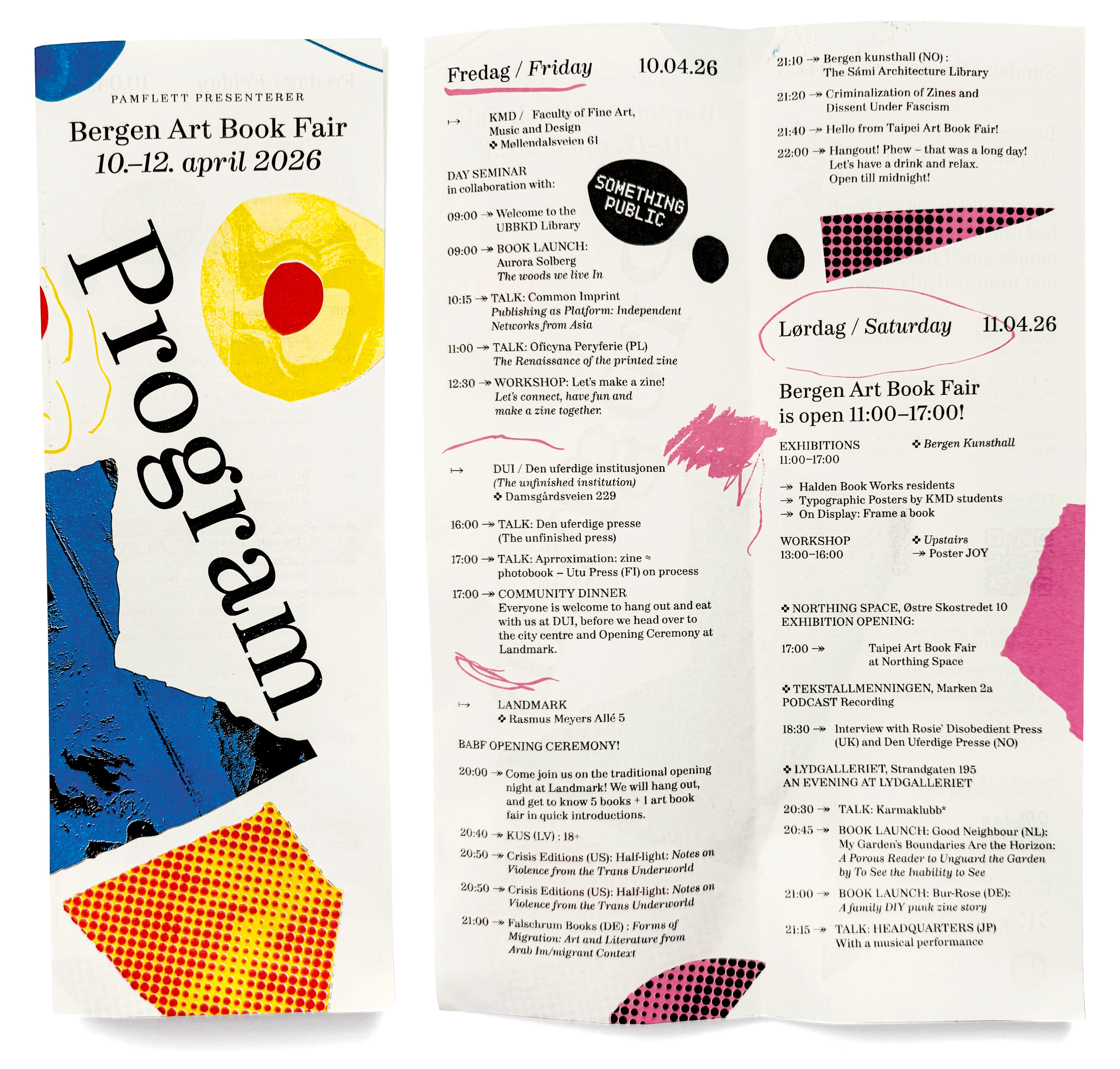
The other big item on my agenda aligns with this too—the Bergen Art Book Fair, which I think could perhaps more accurately be described as a small press festival. Because the tabling part of the fair was not really the beauty of the week I spent there—it was just the excuse for a gathering. And the efforts of the fair organizers really went to facilitating and expanding this coming-together—the days before the fair were filled with talks and meals and performances and workshops. So that the actual sales event just sort of felt like a natural consequence of bringing so many press people into the same room. That’s not to say there weren’t sales, or the experience was immaterial (a lot of people I talked to mentioned that this was the fair where they sold most easily the finest of their fine book projects; and of course the books themselves are what we shared in common)—just that the richness was about community, not product/object.
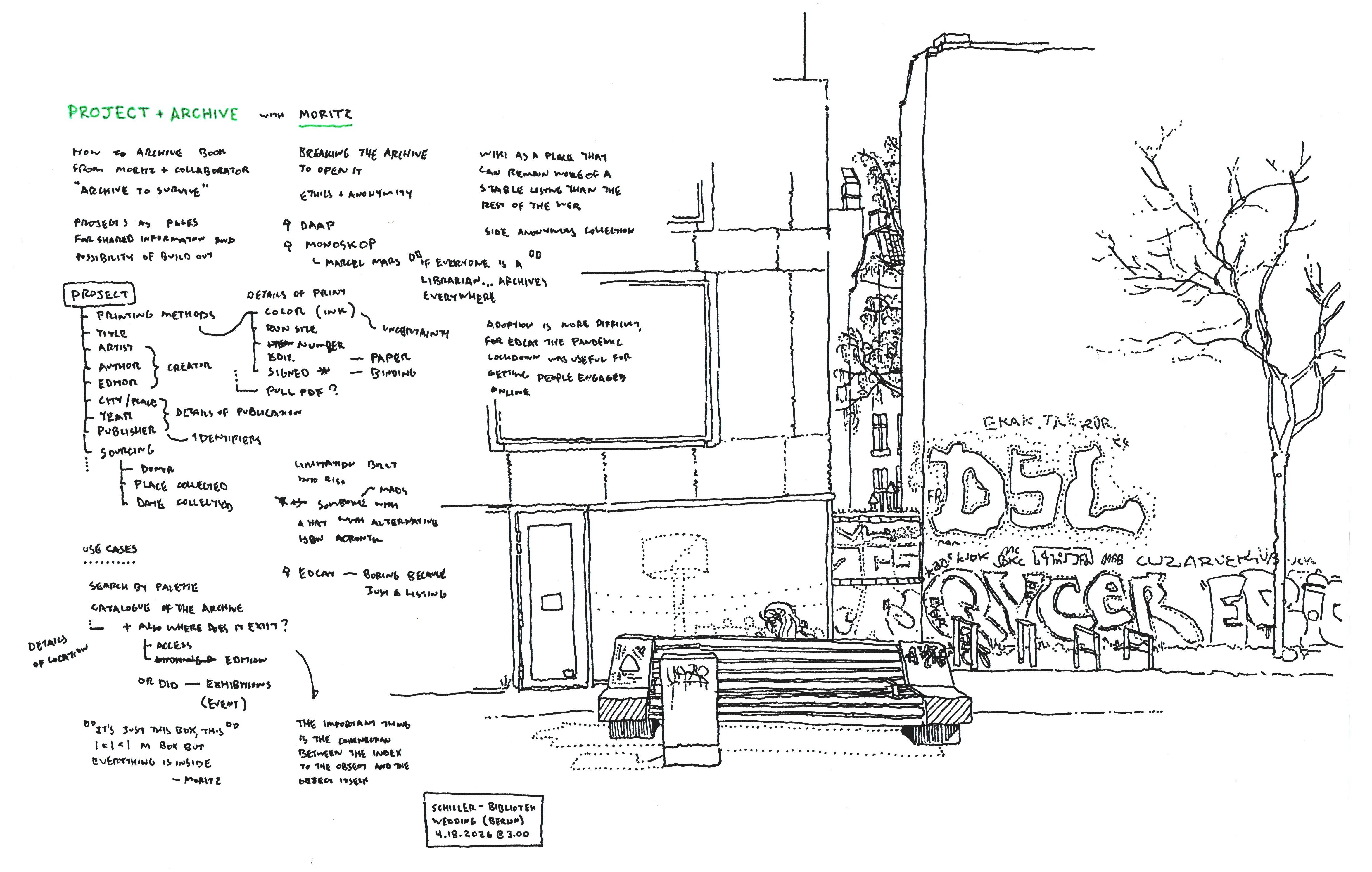
Moritz Grünke of we make it and the Herbarium archive was describing his intentionality around how he keeps and documents his archive of riso-printed books and ephemera—since the point is the materiality, the print, the most important thing in a catalog is “the connection between the representation of the object and the object itself”—so things need to be findable. This is some basic archives stuff, but when we talk about zine libraries and collections as being a distributed archive, then the important thing is to allow a reference/entry/image to be connected to multiple places, to all the libraries which hold the text—as means by which it can be held by you, too.
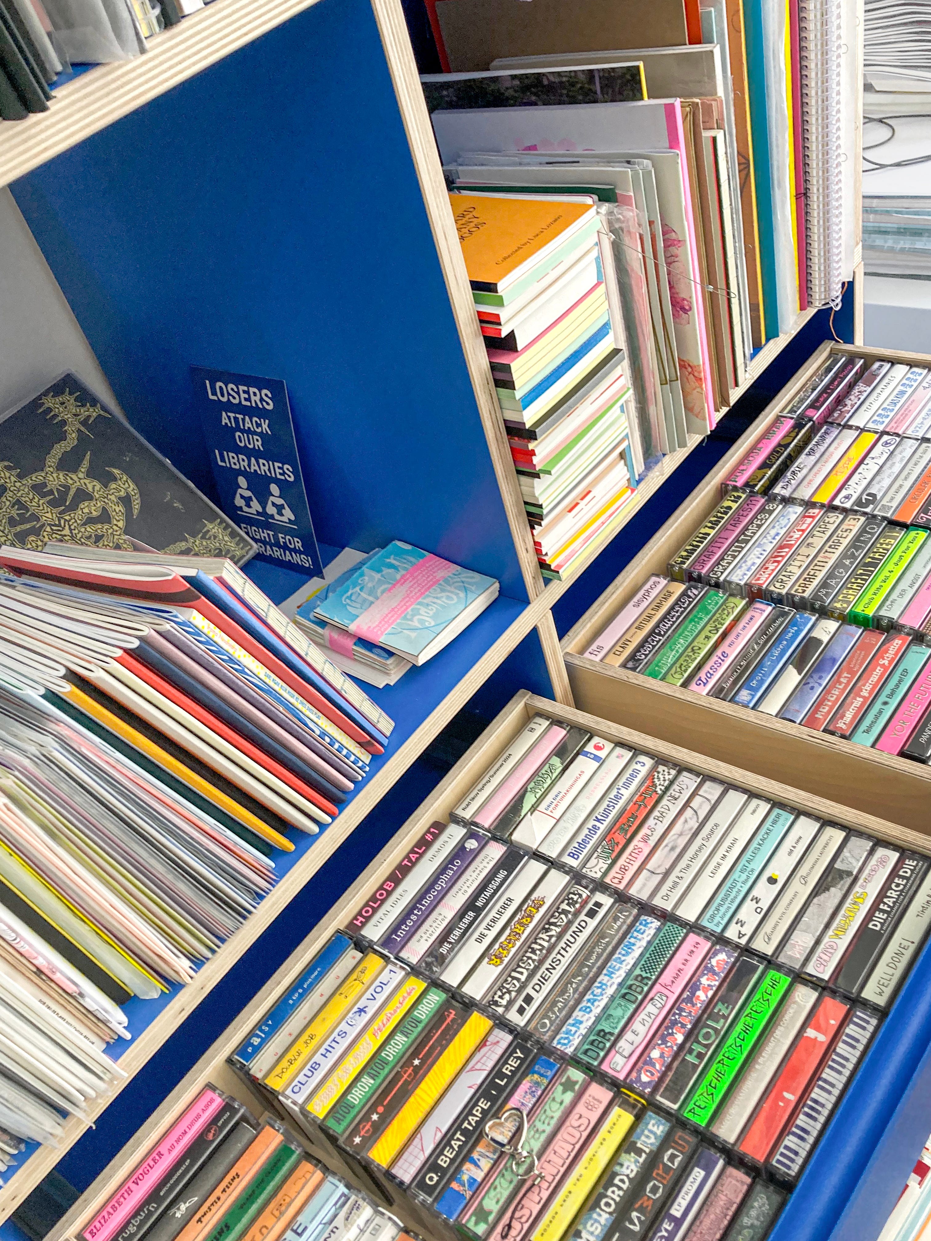
Oscar Ginter at Quintal has a color separation methodology that I really like (full method listed below)—which is really based on the principle that: as a printer you are training yourself about how your equipment prints—and you should trust the things you have learned. As he explains it, the risograph is an uncertain process, the machine does its own interpretation of whatever files it receives or images it scans, which always results in a print that is different than what it was fed. And for the most part, we try to plan for this by trying to simulate, or calculate what that effect will be when preparing our images—but for this, we trust the math and the algorithms that have been developed for riso, and we remove ourselves a little bit. Instead of aiming for absolute certainty, his solution is to add another layer of uncertainty—in the form of moving most of the decision making out of the algorithm and into your eyes and hands. In this way, you add your own interpretation into the process, which, as you gain experience, can compensate for the riso’s interpretation.
Here’s how this plays out practically:
At Quintal they use no absolute swatches or color values to represent different riso inks, they just use a color picker to grab ink colors that feel appropriate to what they know of the ink they’ll be printing with. If they have doubts, they just hold a printed swatch up next to their screen to get a close optical match. Besides bypassing things like screen calibration and the need for perfect color sampling, this also allows you to sort of reflexively compensate for things like paper tone, or how you’ve learned certain inks behave, etc.
They also treat all separation tools as just tools for separation, not tools for printing. The job of them is to split out ink channels, but it’s your job as the printer to figure out how you want that to happen, and then to manipulate the results into something you can print with. So if you get a better separation on an image using inks or colors that you won’t actually be printing with, or using an unconventional method, do that instead—but again, you’ll have to trust that interpretation described above.
It’s a really interesting philosophy—and it’s like the opposite of the Pantone approach. By adding more degrees of freedom, the whole system gets softer, but also more flexible.
The relationship between independent artist presses and corporate RISO Kagaku branches is very different in Europe than it is in the US. For starters, there are multiple branches, and most major cities have some kind of dedicated, certified riso technician available for repairs.2 And publishers are buying inks directly from the company (including the ability to buy 10 tube cases of Pantone-matched custom colors). And this changes a lot of things!
There’s less of an overall precarity of presses, but because they can depend on the company, it sounds like maybe a little harder to build community between presses—they don’t have to be codependent in the same way I’m used to. That’s not to say there aren’t efforts to build community (like Norsk Risoforening, or that recent gathering of presses in France by Quintal) but these have to be intentional, they don’t come about as a natural consequence of seeking/needing support.
It seems like the printing scene is perhaps a little more competitive, at least when it comes to job printing. It feels like there are only a few major job printing powerhouses, which are surrounded by constellations of independent publishers and small artist collectives. But for those who are established, the work is pretty stable and consistent—there’s a love of riso-printed media in the art world, and a demand for it—there’s less of the looming specter of digital printing there. Though, it is not fully absent—as Knust describes it (paraphrased) “through the years, the cost of [duplication] has remained the same, but the other options are cheaper and cheaper, so more and more people print online.”
Within the European region, there’s riso branches in France, Germany, the Netherlands, Spain, Portugal, Italy, Turkey, and the UK—that means that everyone kind of has multiple choices of who exactly they’re doing buisness with. And each of those branches sells machines and ink with a slightly different selection, and different rates—so there’s a lot of discussion and comparing of notes to figure out who to work with. That extends to the technicians themselves—there were definitely cities that had better relationships to their local technician than others—to the point that they’d try to coax technicians to operate outside of their service area (with varying success), so that they could get the more experienced tech from the next city over, instead of the novice one where they were based. And even so, a lot of other presses are still buying machines and drums through China for cheaper rates, even with shipping.
Many of the presses had full service contracts with riso—this is pretty rare in the US (except within schools and institutions). Each of these deals seemed a little different though, so it seems like they depend on the specific office (or even specific negotiations). Most deals came with access to a technician and replacement parts; some included standard inks automatically replenished as part of the monthly contract cost; some excluded certain parts from replacement (in one example, the TPH—the most expensive single component—was not covered in the contract).
Obviously the economics are very different—the degree of government and civic funding for artists is expansive and normalized—it’s something (almost) everyone depends on (and more or less can depend on). Whether that’s individual operational costs, subsidized studio space, training stipends, or even just healthcare: the artists are taken care of by the state in a way that is totally (and cuttingly) unfamiliar to me. There are a few caveats though: (1) For foreigners it can be really, really difficult to break into this funding—sometimes taking over a decade to access a fraction of the resources available for locals. (2) Everyone I talked to described a gradual erosion of funding for the arts over the last few years, which has led to a slow scaling back of offerings, the need to seek other sources of funding, or sometimes forcing a radical restructuring, in order to keep long-running projects going.
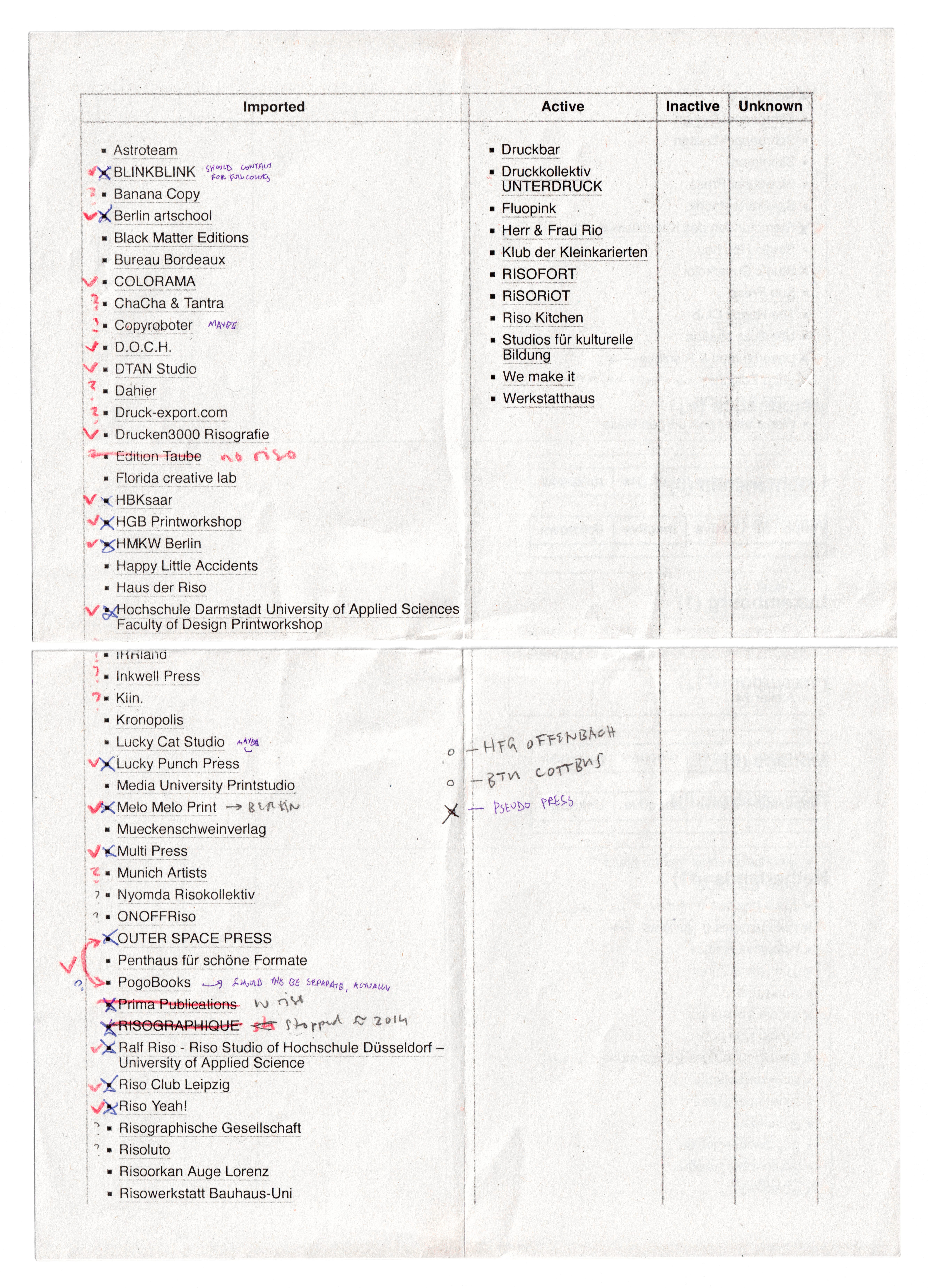
In Norway, there is a 5 year mandated warranty on equipment: like cars and computers—and duplicators. You don’t have to pay for anything extra—it’s just part of the service requirements in the legislation which governs anyone doing business in Norway. This is a very different systemic solution to the same problem that the right-to-repair movement is aiming to address: the issue of planned obsolescence. If the company has to take on the cost of repairing and maintaining the equipment, then the economic incentive for them shifts from making things that will need replacement to making things which are easy to repair—because they have the responsibility for that repair. I’ve thought about it for a little bit, and I think I prefer the right-to-repair ethos (though both would be nice), because it gives more autonomy to the user/artist, but it'‘s certainly food for thought, and I want to learn more about how this policy came to be, and what effects it has on the art community in practice.
PRINTING PROCESS
The Quintal separation method for color images (especially photography) gives dynamic control over the logic behind how mixed tones are represented in different inks—I’d say it’s especially good for process printing. See, in most separation methods, at some point you “split” the image into the different ink channels—once that split happens, you can balance the individual channels (adjusting levels, etc.) but they are independent things. (In spectrolite this happens at the “RISO-ify” step, when using ICC profiles it happens at the “convert image to profile” step.)
Create duplicate layers of the original image for each ink color you are planning to print with. Label them with the ink color they will represent, and set their blend modes to “multiply.”
To each of these, create a B/W adjustment layer, with the base layer as a clipping mask (so the adjustment only applies to that layer).
Also to each, above the adjustment layer, add a fill layer, in the color of the ink (more on this later), also clipping masked, and with a blend mode of “screen.” It’s important that these layers are also labeled distinctly. (At this point you’ll have created a file very similar to the PSD export from Spectrolite, except instead of pre-separated grayscale channels the full color image is the base for each.)
Within the B/W adjustments, lighten up all hues except for the closest match for the ink color (this is to set a starting point). Now the image should start to resemble the composite color original.
Next, in each adjustment layer, fine tune the other sliders to determine how much each of the other hues are represented by that ink color. Darkening the green slider on the yellow layer will add more yellow ink into it, for example, skewing it into lime territory. If needed, additional selections and refinements can be built into the layer stack for each ink, beneath the fill layer.
Another duplicate of the original image can be made above all of these layers, to be toggled on and off, comparing to the original.
Point sampling (hidden behind the eyedropper tool) can also be used as a bit of a sanity check, to see just how solid each layer is.
For export, if the layers are properly labeled, it’s quick to create a Photoshop action that creates a new file at the correct size and pulls each grayscale layer (with the color screen turned off) into the channel of a CMYK+ document (which can then be linked in InDesign, for example—or split and saved as grayscale images.
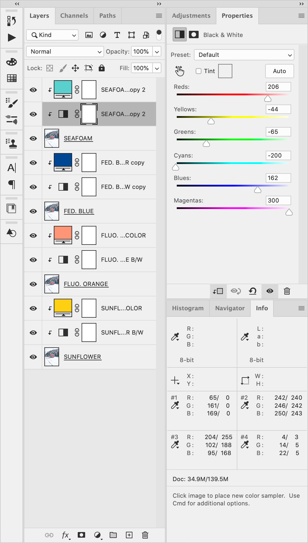
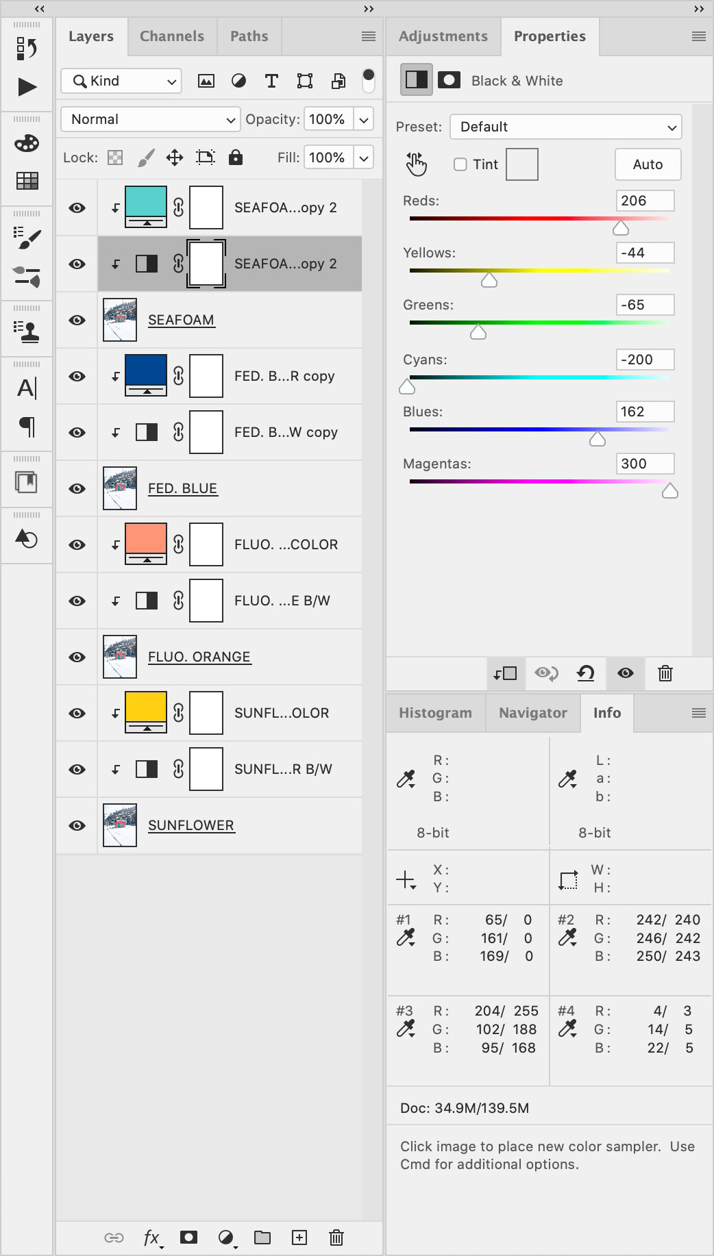
The essential windows from the Quintal method—in this case I’ve separated the image at the end of this post into Seafoam, Federal Blue, Fluo. Orange, and Sunflower (or what I wish Sunflower was, rather). You can see in the Seafoam adjustments, I’ve maxed it out for the cyans, and also have it popping into the greens and yellows (I want the yellow nice and muddy). I have neglected to include the original overlay layer to compare my separation to the source image. I will say, about this method—it’s a little scary powerful, and you have to get really deft with your color theory before it feels natural. It reminds me of playing a racing game3 where you select one of the advanced vehicles, and suddenly a slight shift of the wheel sends you careening off the track.
Oscar has also pointed out that spectrolite’s method of extracting Black from an image (and leaving only mixed color hues behind) is much cleaner than anything built into Photoshop or other separation techniques.4 So often, when he is printing with Black, he’ll separate it in spectrolite first, as a wide gamut four-color CMYK approximate, then recombine and flatten the CMY layers, and separate them using the above method—keeping the K layer multiplied on top.
One of the harder things to get a riso to do is print a nice clean opaque ink on a dark or midtone paper—but there’s an optical trick I learned from Knust to make the printed image pop more.
(Knust probably needs their own post, dedicated to all the stuff I learned while visiting—but I’ll fit what I can sprinkled through this post).
When trying to print a one-color White (or Light Gray, Mist, Metallic Gold, etc.)—if the exact paper color is trivial, you can darken the rest of the sheet to make the light ink pop more. You really need a two-drum machine to make this work, because the alignment has got to be spot on if you are trying to use this trick (especially around text or fine line work). Print the image with one drum, and for the second drum print a 10–25% overlay in all the other areas. Use an ink that’s a similar hue, but a slightly darker color than the paper itself—the little sprinkling of dots is almost imperceptible when matched like this. You can even print Black ink on black paper to darken it further.
Knust also has their own separation technique (also employed by Colorama) that I did not understand as well, but I will do my best to try and describe it (Jan Dirk de Wilde ran me through it very quickly in the last hour I was there). Essentially, they are generating custom profiles from within the “color settings …” dialogue in Photoshop—by dragging the tone curves by hand. You have to switch the display to “proof colors,” then for the profile, select “custom CMYK” (or RGB, or grayscale), and switch the gain from “standard” to “curves” to get to the point that you can shift things around. Then they can develop and save a profile, and apply across it across the whole project. They also use a lot of point sampling to keep track of what inks are going where. But I’m not sure if they are doing this in CMYK, or defining custom inks, or to what degree things are adjustable—nor what kind of training or experience you might need to anticipate what the printed result will be. I would like to go back and try it out myself.
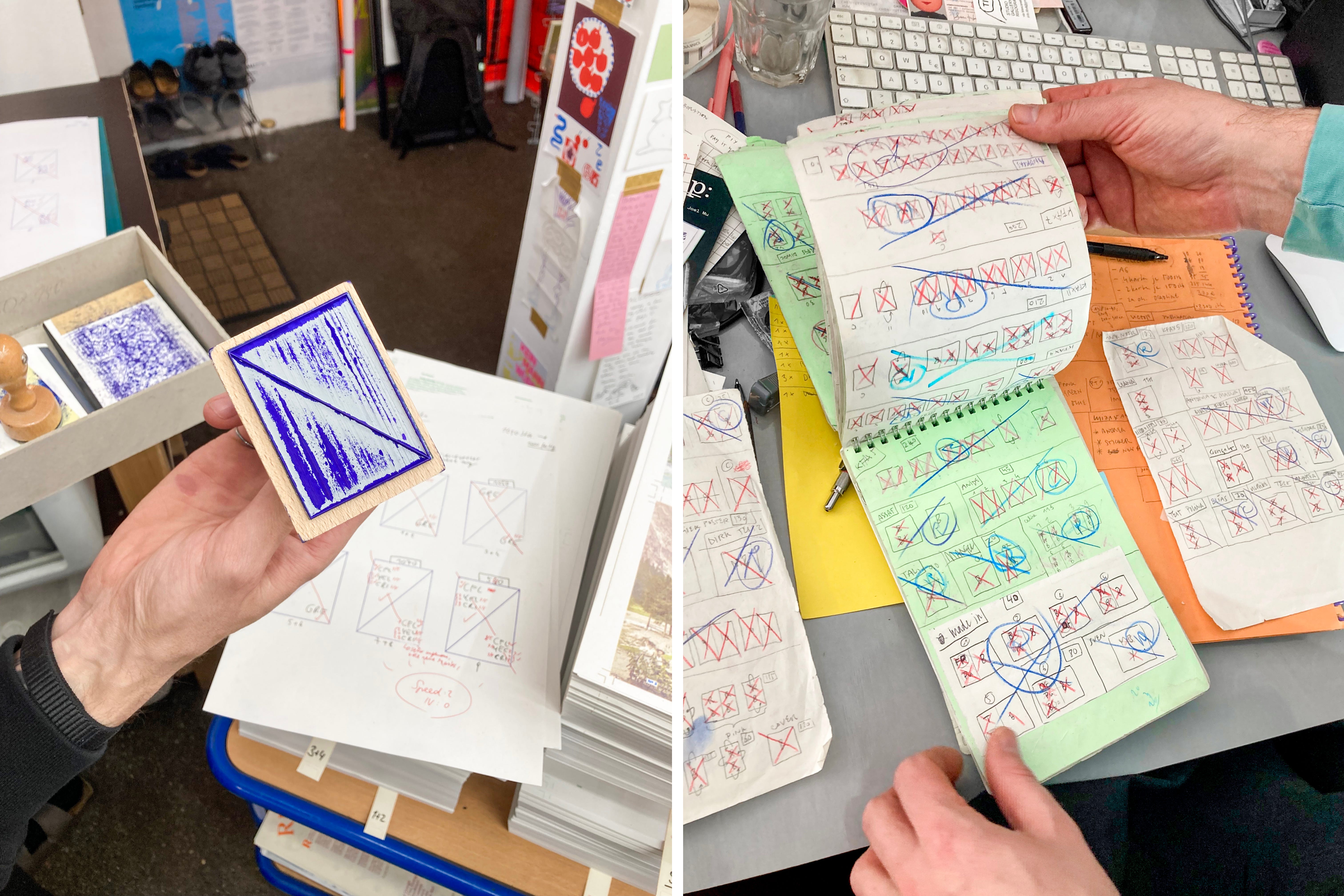
OPERATIONAL TECHNIQUES + MECHANISMS
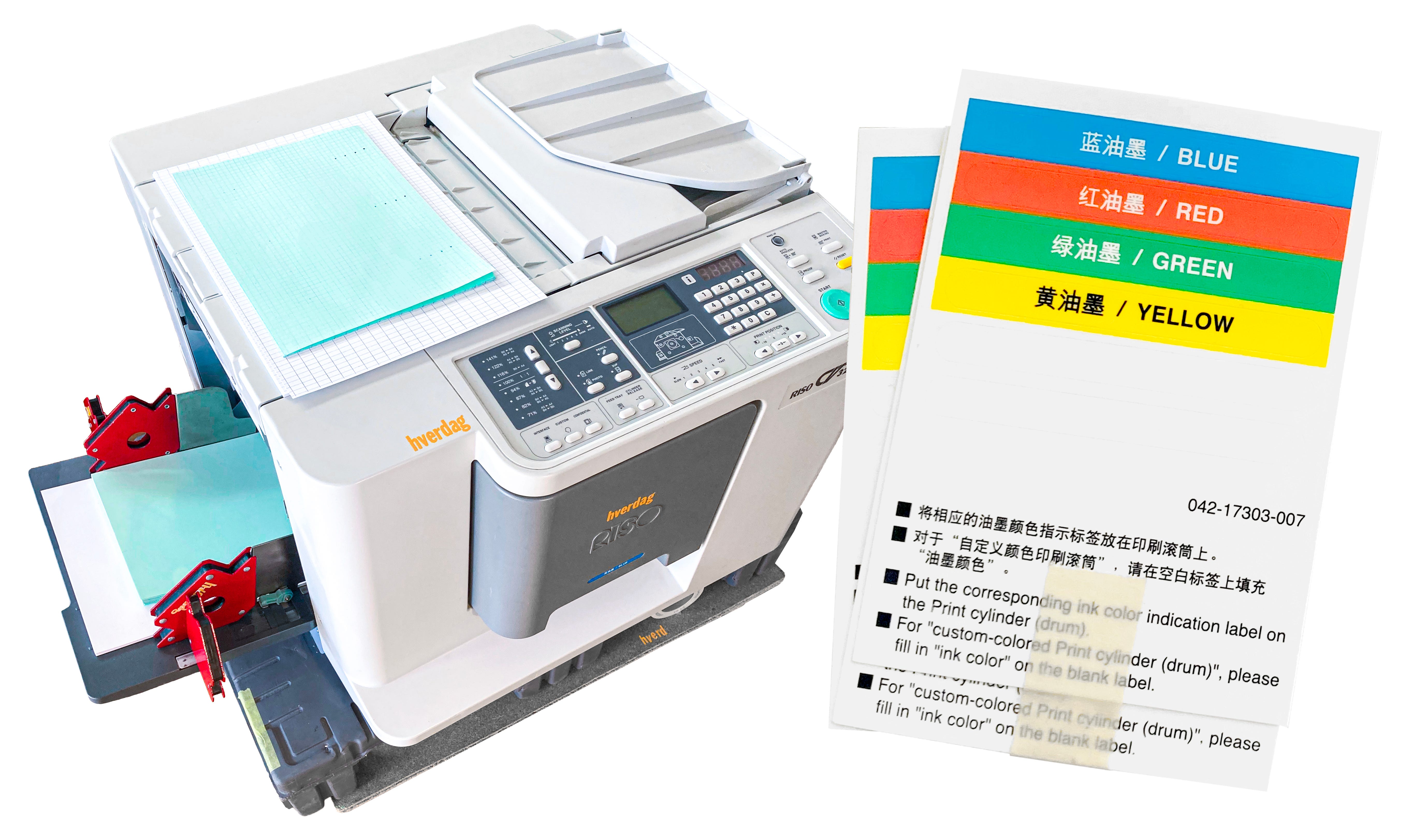
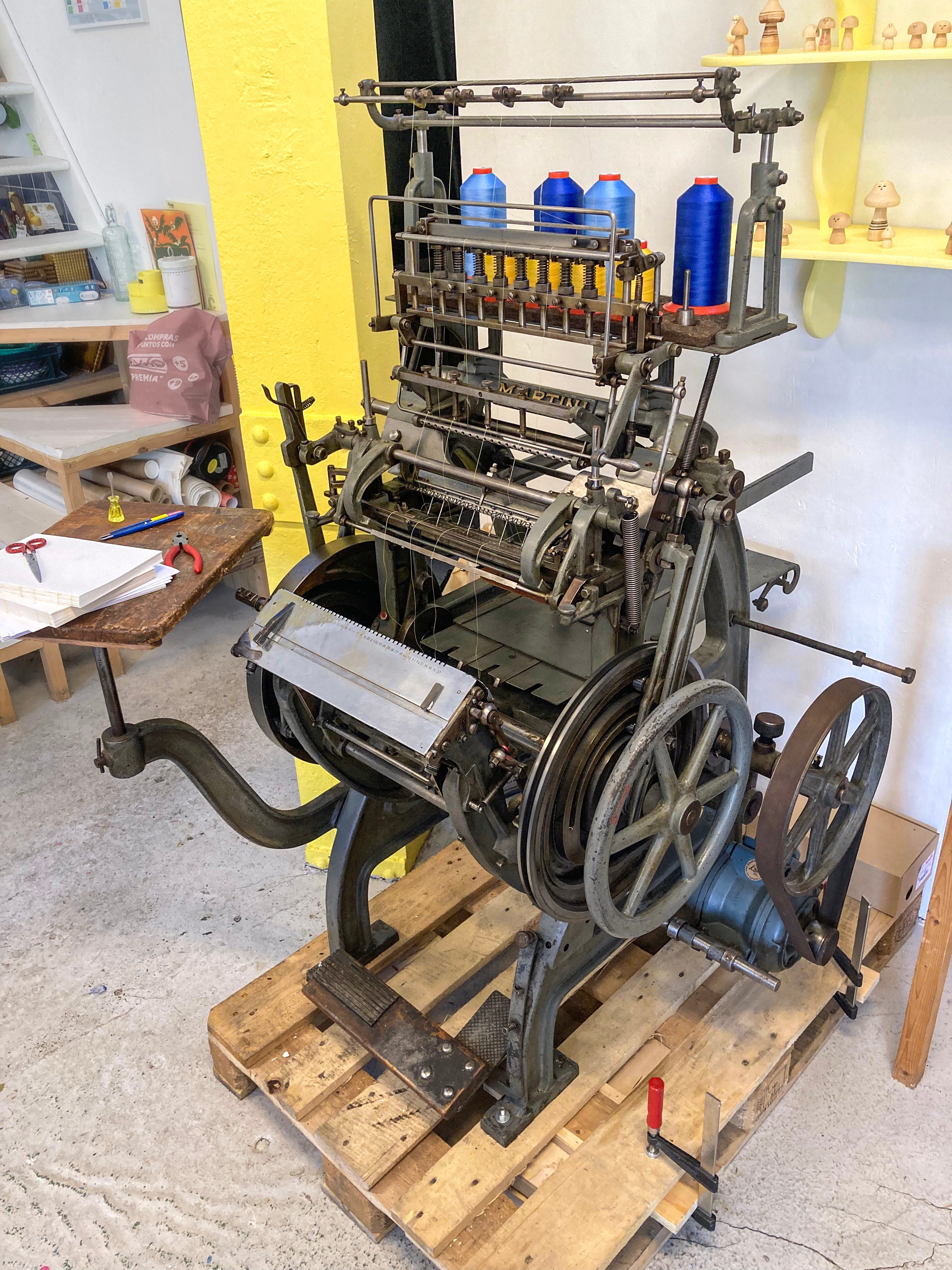
I got to meet my first of the smaller table-top risos—Jessica Williams’s CV3230 at Hverdag Books!5 I have always been curious about these machines, but now that I’ve worked on one first hand, I love them. Much like how the GR/FR family and the Z+ machines operate on the same basic principles, with very different innards—the little machines have all the same concepts, just implemented in totally different ways. It felt like opening up an unknown creature and knowing that there were probably a heart and lungs somewhere, but I wasn’t quite sure where. Some observations about the little machine:
It really is extremely conservative with space—no wasted space, that’s how it’s so small. There’s not even a front door, the front face of the drum is what seals up the opening.
The bigger risos split up the computerized portions across many circuit boards, but in the little machines it’s really just two boards—so an ongoing problem with the button sensitivity was fixed by replacing a button cell battery (which in other machines is just responsible for retaining user settings when the riso is turned off).
They can comfortably be lifted by two people, and fit in a small hatchback with room to spare!
There are so many fewer adjustable components—so any fine tuning of adjustments are done by hacks and shims instead! For example, the mechanism for adjusting forward/back positioning is just by adjusting the side guides on the feed tray—because they don’t center the paper, they move independently, so you can just lock the stack in anywhere. Annoying to adjust and dial in the print position, but also so much freedom.
The little ink tubes are very cute.
I also got to check out the V8000 model at Knust (where they have two!)—which really just chews up and spits out my previous statement that most risographs “operate on the same basic principles.” These are wildly different from any other machine I’ve seen—and honestly really innovative to what stencil duplicators could have been, if they were built to printmaking standards instead of office ones.
The paper feed and press system is a total departure—the V8000 uses a solid metal pressure roller (identical diameter to the drums) with a paper clamp built into it (sort of like a cylinder proofing press). So, mechanically, when the paper is fed into the riso, it is grabbed by the pressure roller which then spins it past the two drums in succession—as one rotary movement. The solid roller means that the impression is much darker, and the clamp means that the feed is really consistent and clean.
The screen and drum body are built together as a composite silicone mesh, stretched over the frame of the drum—so the drums can’t really be dented, the mesh is soft! I don’t know enough printing methods to know if this is true or not—but it seems that in the impression process, at least one of the components has some softness built in (padding, rubber, etc.)—to allow more even pressure distribution across the image. In most risos, that’s the rubber pressure roller—but in the V8000 it’s the mesh.
A lot of things about the RP line of machines make sense now—the V8000 was the top of that line, and the RP and RNs use as many interchangeable parts from them as possible. However, the V8000 is a huge machine (it’s about the size of the A2, and uses the entire area of the cabinet that most risos sit on) and the chassis is really reinforced—there’s so much bracing, even on the drums themselves, to handle all the power the drive requires. But the RP drums don’t have any of that support, so their gears just get smashed up by their drive system. In the same way that you can’t make a small giraffe, the V8000 is a machine that really can’t be scaled down without losing its structural integrity, which is part of the reason that RPs are so unstable.
Knust has been around through the birth and death of multiple duplicator companies—and they still a lot of machines that are so obsolete that their ink hasn’t been manufactured for decades. So they have a unique perspective on how we have landed in the present moment of riso duplicator supremacy—here’s a quick version of their assessment of other machines:
RICOH made the best machines—they were compact, fully featured, and stable—they also gave a lot of control.
DUPLO had the most consistent paper feed (which makes sense given how much experience they have had in other bindery equipment).
RONEO had a feature not seen in other machines: skew control, which made a big difference in art printing. They were also the closest to the older mimeograph design. But each individual machine (even the same model) might behave really differently, so if you had a handful you’d end up using each of them for a different task.
RISO had the best ink—and that’s really where and why they outlasted the other duplicator companies, the value of the riso was in the ink (which fits in with the history of the company as first and foremost an ink manufacturer).
The ink thing a double-edged sword because it means that while the image quality is better, the equipment is heavily specialized for that ink, and requires ink with exactly those properties to function. For other models, Knust has been able to mix their own inks after the companies went defunct (and experimented with this beforehand too), but for the risographs, they have always required the company-made ink.6
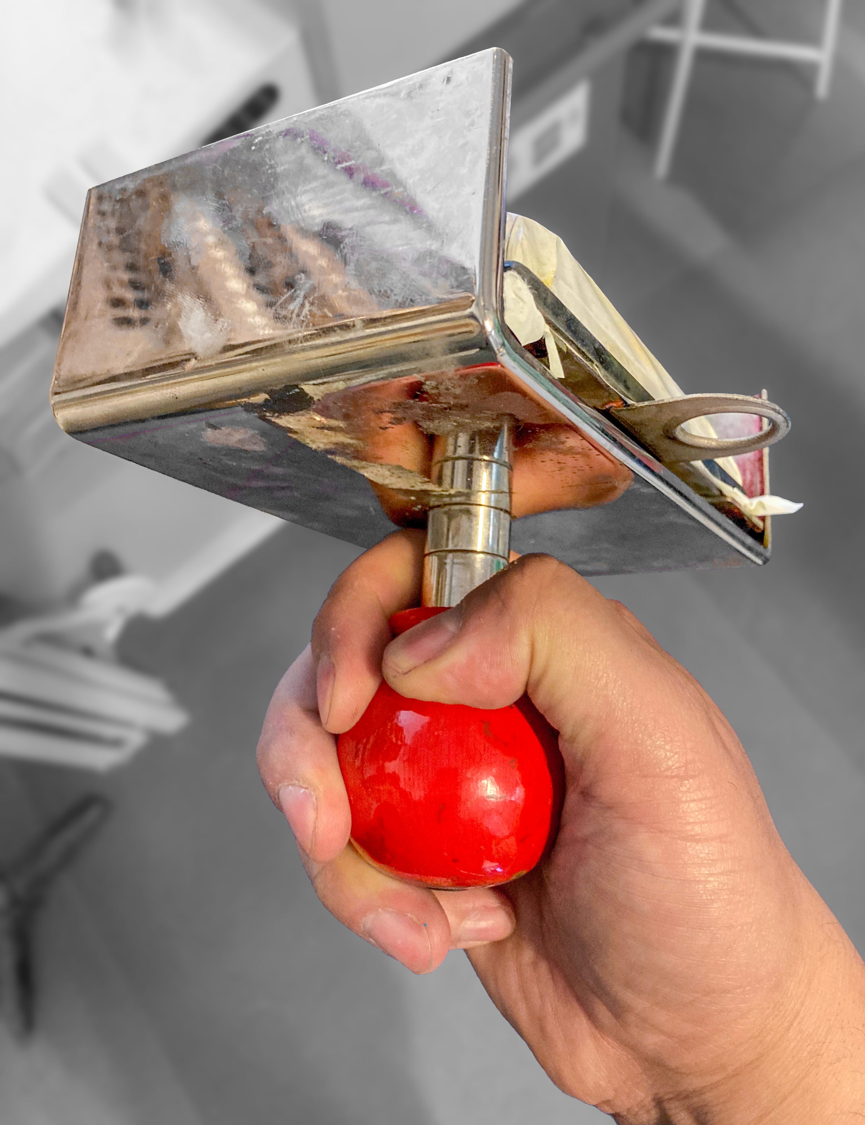
I was introduced to a very cool tool at Knust—a stencil stamp. Essentially, you make a perforated stencil (using any type of stencil technique you like, including the thermal process used in risos), then stretch it across a felt pad impregnated with ink. This will pillow out the stencil slightly (much like the rubber transfer pad used when screen printing on rounded surfaces)—to print, just roll it across the paper. I’m very curious to experiment with this technique, especially to add some elements with dynamic positioning to prints.
Joyce Guley has a drying method I had never seen before, but a few weeks later, a number of French printers reported doing something similar—she jogs small stacks of 15–30 prints, then blows into the stack while holding it vertical, to flutter the sheets apart, before quickly casting them in a wide arc onto a tray of a drying rack. It’s like watching a very skilled card dealer fan a deck out on the table.
Hugo Rocci, who runs Terry Bleu (which I think is maybe my current ideal studio space and shop scale) has a trick for getting the riso to feed difficult heavy stocks: hand feed the first two sheets. As the riso is getting ready to print, and raising up the elevator, lift up the first two sheets slightly at the back of the elevator, and push them in lightly as it goes to feed them—a manual assist.
What I think this is actually doing is decreasing the amount of loading force needed to set up the subsequent sheets against the stripper pad. Basically, when the riso goes to feed the first sheet, it has to do a little more work than subsequent sheets—it also needs to pull in the 2nd/3rd/4th sheets in slightly and fan them against the stripper pad. Then when it gets to the point of feeding those sheets, they already have a little bit of a head start, which the first sheet does not get. So by hand feeding7 the first sheet or two, you sort of pre-load them, giving them that head start yourself.
One of the more annoying side effects of some misfeeds is that the riso won’t catch them in time, and the drum will print directly onto the pressure roller. This results in a doubled image (because the pressure roller then prints this ghost onto the surface of the stencil), and a strip of repeating image on the underside of the paper—the solution for this is usually just to “print it out”—but this wastes 5–10 sheets of paper, and more importantly, time if you have to swap the stock to protect your actual project paper. While this is a sign that your feed settings need adjustment (or the feed system needs calibration), Hugo also has a workaround to avoid this when printing a single color on two-drum machines. While the riso can’t catch a jam like this in time to stop the first drum from printing, it can catch it in time to stop the second drum. So print in two-color mode, with the image on the second drum, and a blank/confidential stencil on the first drum. Then when the jams happen, at least you won’t have a ghost!
I helped Martin Kollmann at Risofort to mix up some Flatallic Gold (equal parts Metallic Gold + Flat Gold—a better behaved ink), and he’s got a different method of pressing the plunger back into the end of the tube, without trapping air underneath it. The method I’ve seen most (and use myself) involves pushing the plunger fully into the ink at an angle, then flattening it out. But Martin pointed out that before reattaching the black plastic cage, the ink tube is still malleable, so you can just squeeze it slightly to allow air to escape around the sides of the plunger while pushing it down.
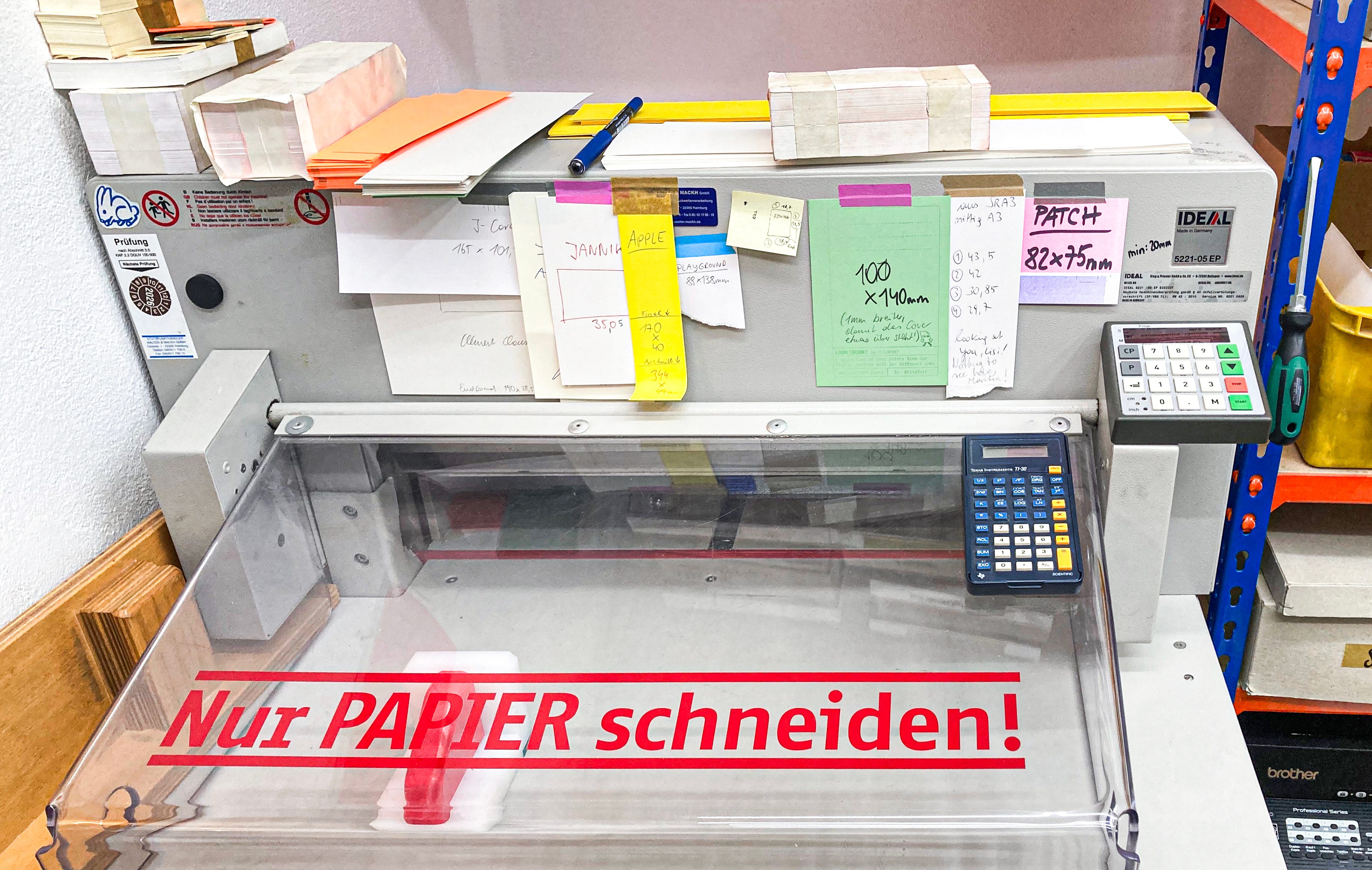
I loved all the systems that are in use at Risofort (also their commitment to collecting and saving all the various bits of ephemera and packaging that show up in a printshop)—but one of the most elegant was that they have a basic calculator taped to the plastic guard on their stack cutter. So they can easily do calculations when figuring out their cuts on a project.
There were lots of small repairs, but the big repair + mystery was a drifting skew on the new MH at Colorama. Basically, after about 30–50 copies, the skew on the printed image would begin to drift, up to 2 mm, settling and stabilizing at around 100 copies. This made it really difficult to compensate for skew digitally (the standard method)—because you wouldn’t know what the skew actually was until you were 100 prints in. The only solve at the time was to tape down every stencil right after it is made to prevent it drifting. We only found the issue by process of elimination—ruling out all of the (many) other sources of skew.8 It came down to miscalibration of the pressure roller mounting system itself—the pressure roller was crooked relative to the drum and paper feed. The hooks which hold the roller bearings are adjustable, but there is a lock fixing them at (what is supposed to be) the correct calibration (held in with rare 5-pointed star Super Torx T10 screws). However, in this case it was crooked by at least 1 mm, and we had to undo the locks in order to adequately shift the roller (resetting them once we found the position that resulted in stable skew).
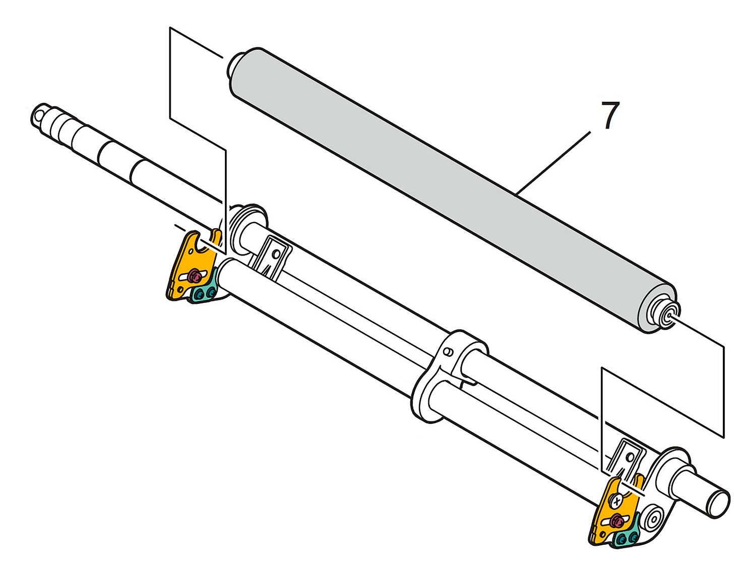
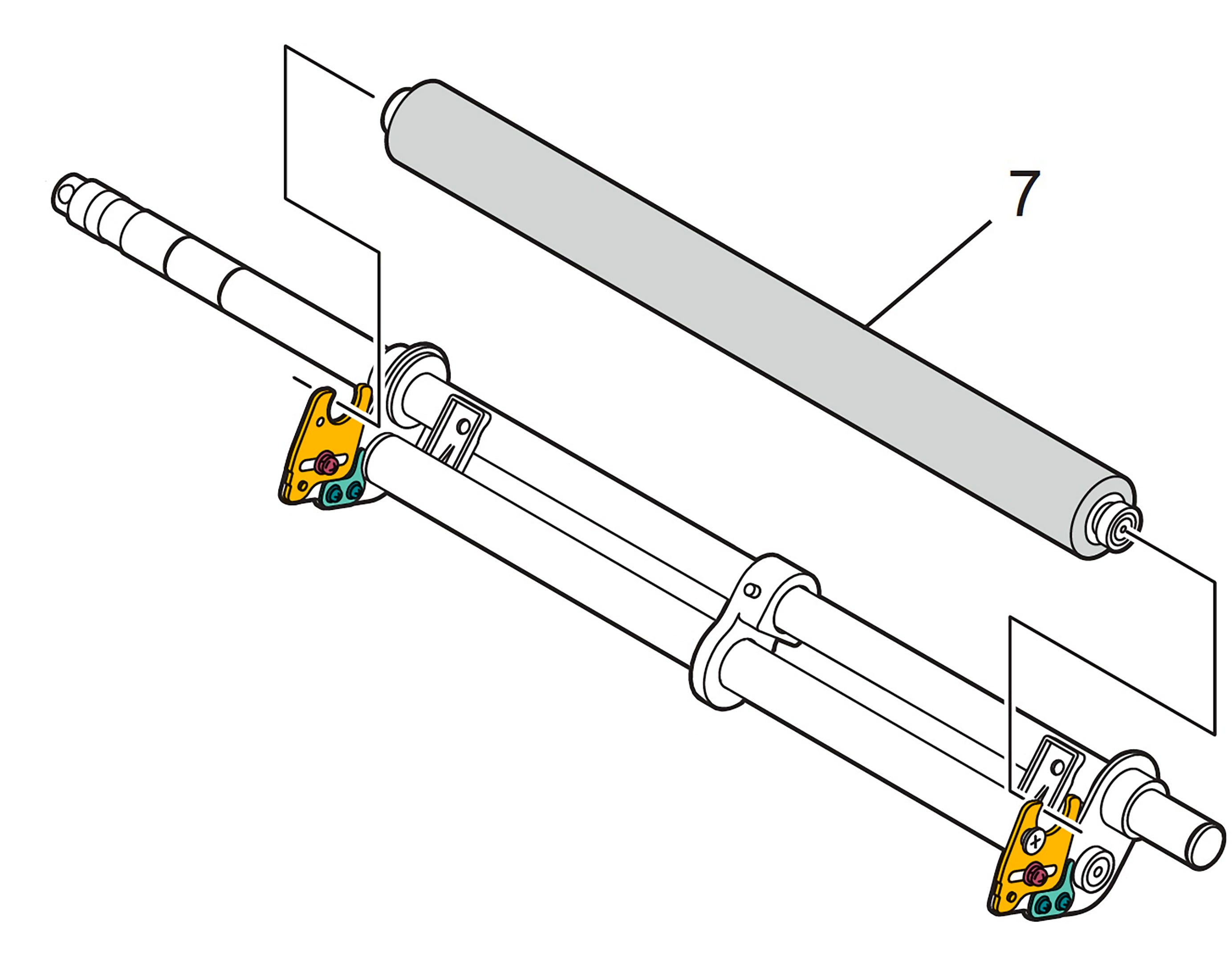
The pressure roller (7) is suspended in the two bearing hooks (Sunflower), which are each adjustable with a single screw (Raspberry). They are stabilized in what is supposed to be the correct calibrated position with the little L brackets beneath them (Seafoam) which are also adjustable, and secured with special Super Torx T10 screws (Teal). The relative position of these two plates is what sets the side to side angle of the pressure roller (or “yaw” if it were the tubular body of a plane) which must be parallel to the drum—the up/down angle (or “pitch”) is allowed to wobble (on that middle pivot block), so that it can self level when pressed against the drum. 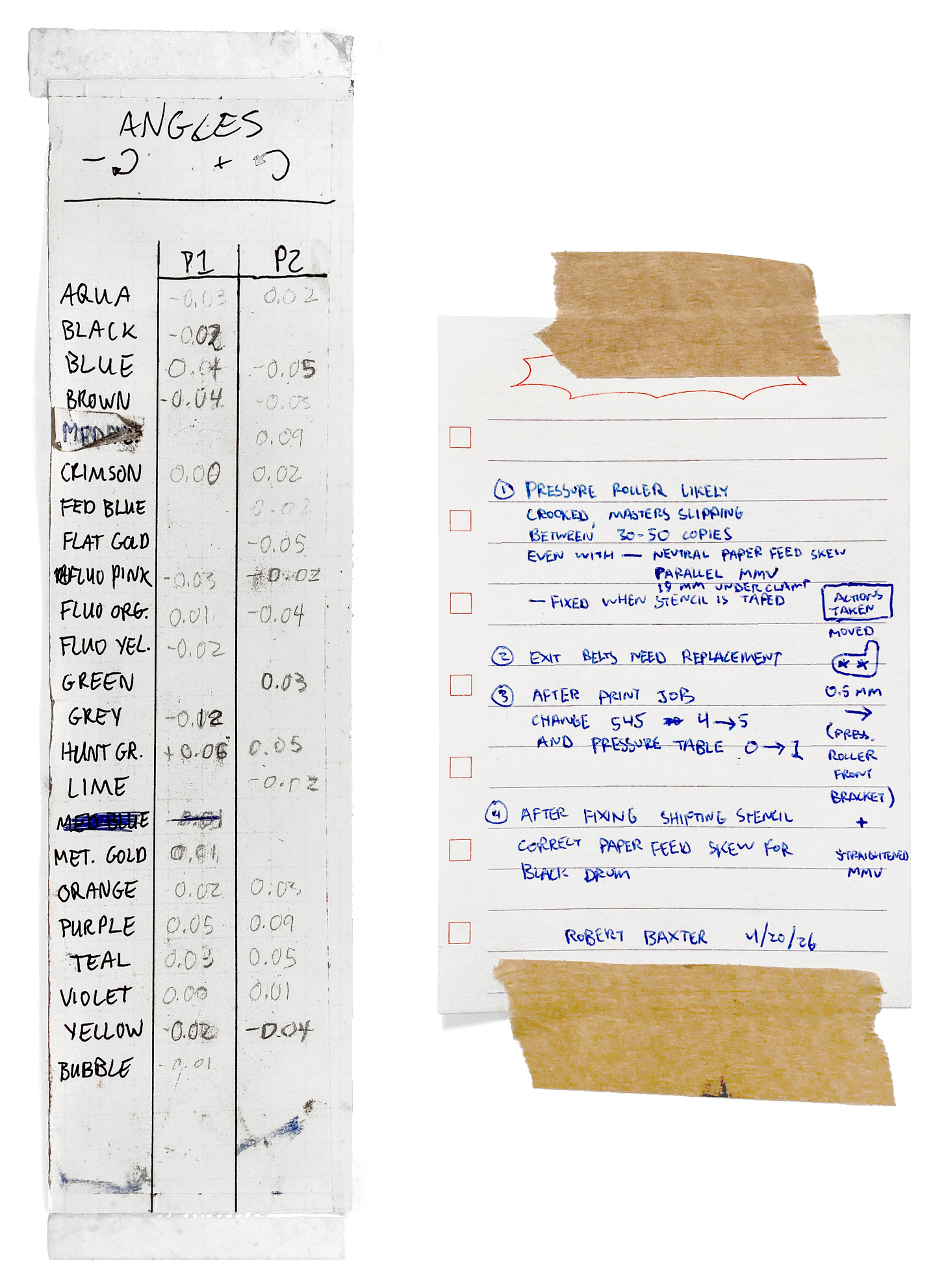
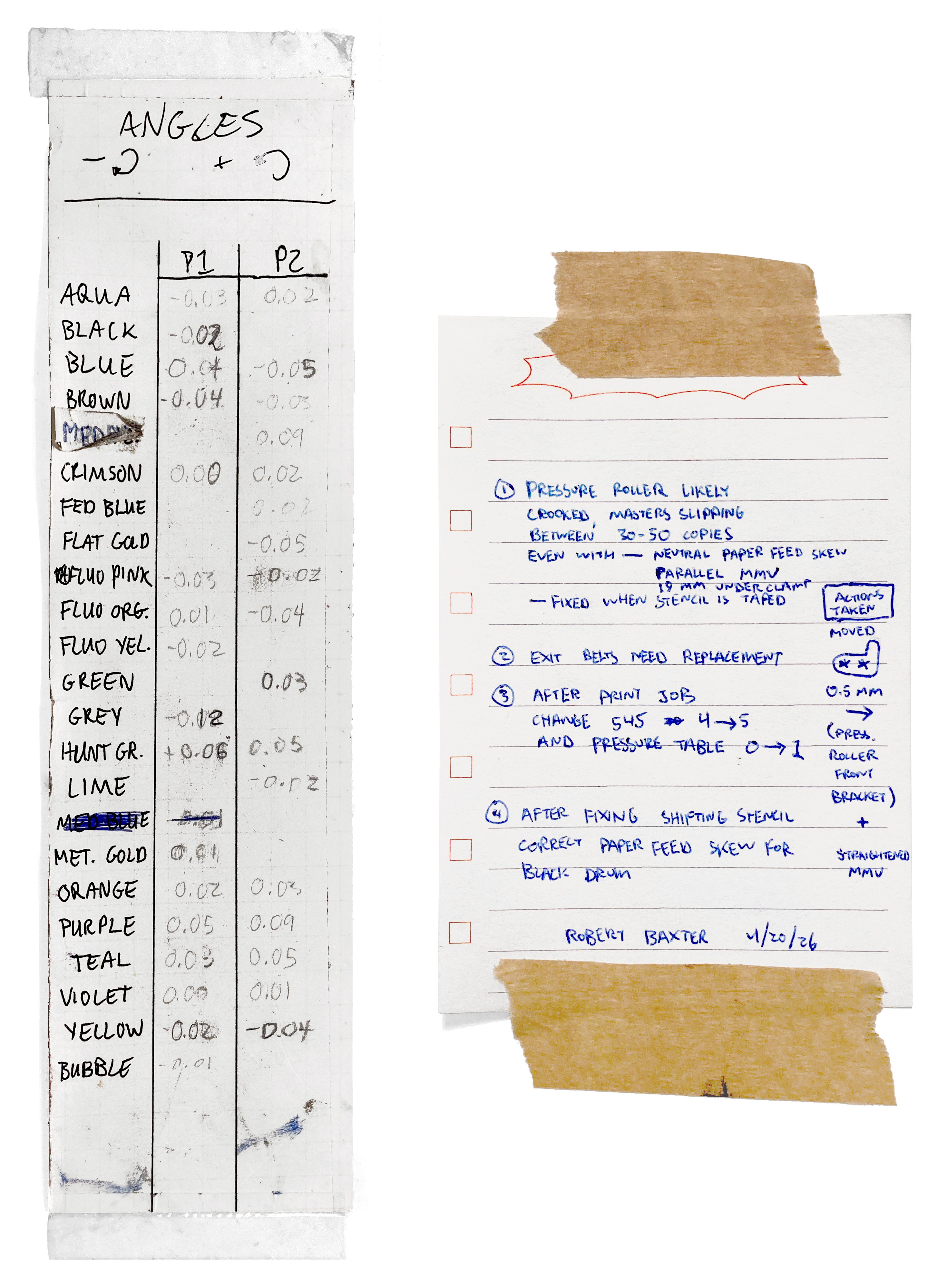
Two notes from this process—on the left is Colorama’s listing of the adjustment angles for each of their drums in each position—which, while slightly skewed, are at least stable when the pressure roller isn’t crooked. At the right are my notes of the repair we did (and what remains to be done), taped to the side of the riso—I usually leave these on longer repair jobs. In conversation with other presses, this seems to be a not-uncommon issue with the MH line—some factory standard has slipped (or jig is poorly manufactured, etc.) resulting in lots of machines going out with crooked pressure rollers. And since the “acceptable” level of skew is about 1.5 mm either direction, it’s not something that will get caught is the print tests run by official riso technicians either. So, if you are experiencing this drifting skew on your own MH, it’s worth experimenting with the position of the pressure roller (this involves removing the horizontal positioning units to get access to the screws that hold the mounting hooks in place). You can test by printing 10 copies on clean paper, then printing 100 scrap copies, and finally printing on top of the original 10 again.
On touch-screen machines, you can hit the ✱9 button from the print dialogue, which will allow you to save and recall your print settings (position, density, interval, custom paper feed, etc.)! It’s a really nice way to fine tune something for a project and bring it back over the course of multiple days of printing, or even just multiple drum setups.
Trip Logistics
I’m going to finish this report out with some quick numbers, to keep up with my documentation!
During this trip I visited 12 cities, and stayed in 8 different places. Of the 30 nights I was traveling, I was hosted for free by friends for 23 of them—and another 5 were at a really discounted rate in a guest room managed by friends of friends—so only 2 were hotels (which is the only way I was able to afford the trip).
Across 12 studios, I worked on 18 risos (mostly MZ/ME machines, a few newer MH models, an SE, a CV, and one RA (a 35 year old machine with under 40,000 impressions!)—along with 11 drums.
I was working/doing press stuff for 142:32 hours this trip. This averaged out to almost 5 hours a day, every day—but my longest days were 11 hours, so there were definitely some full rest days in there.
58:04     Maintenance + Repairs
23:33     Community Study (the BABF program and the Quintal riso gathering)
20:37     Research (exciting for me——work furthering my own publishing projects)
13:03     Tabling at BABF (2 days of tabling)
10:10     Teaching Workshops
 7:13     Bookkeeping + Business
 5:37     Book Design + Production
 4:15     Writing (Articles for the Wiki + Blog Posts)
Lastly, the finances! No one needs this information, this is more just for my own accountability/bookkeeping, and in case you’re curious.
TRAVEL EXPENSES

FLIGHTS ——————————————————————————————————————————————————————————————
Delta + KLM MSP → AMS → BGO                                 731.10 USD
Norwegian OSL → BER                                         213.62 USD
Air Transat CDG → YUL                                       405.65 USD
Delta YUL → DTW → PDX                       540.97 CAD      393.08 USD
                                      FLIGHTS SUBTOTAL     1743.45 USD
LODGING ——————————————————————————————————————————————————————————————
5 Nights Guestroom                            1250 NOK      134.72 USD
1 Night Selfcheckin Schmiedestrasse          74.90 EUR       87.04 USD
1 Night Quality Inn                          99.00 CAD       71.93 USD
                                      LODGING SUBTOTAL      293.69 USD
TRAINS ———————————————————————————————————————————————————————————————
Vy Bergen Stasjon → Oslo S                    1362 NOK      146.82 USD
DB Berlin Hbf → Hamburg Hbf                  59.99 EUR       69.70 USD
DB Hamburg Hbf → Leer (Ostfriesl)            69.10 EUR       80.28 USD
FlixBus Leer ZOB → Amsterdam Sloterdijk      42.48 EUR       49.35 USD
NS Amsterdam Sloterdijk → Nijmegen           15.48 EUR       17.98 USD
NS Nijmegen → Woerden                        21.50 EUR       24.98 USD
NS Woerden → Amsterdam Zuid                  10.70 EUR       12.43 USD
Eurostar Amsterdam → Paris                  185.00 EUR      214.93 USD
                                       TRAINS SUBTOTAL      616.47 USD
TRANSIT + SERVICES ———————————————————————————————————————————————————
Skyss 7-day Season Ticket                      315 NOK       33.97 USD
S-bahn 4-trip Ticket (2)                     24.80 EUR       28.81 USD
RATP Metro-Train-RER Ticket (5)              12.75 EUR       14.81 USD
RATP Paris Région <> Airports ticket         14.00 EUR       16.26 USD
Orange E-Sim (4 Countries)                   65.00 EUR       75.53 USD
                           TRANSIT + SERVICES SUBTOTAL      169.38 USD

                                 TOTAL TRAVEL EXPENSES     2822.99 USD

TRAVEL INCOME

Tabling Sales at BABF                                       370.15 USD
Workshop Teaching                                          1250.00 USD
Maintenance + Repairs                                      1857.41 USD
Travel Reimbursement                                        914.80 USD

                                         TRAVEL INCOME     4392.36 USD

                                            NET INCOME     1569.37 USD
After the cost of food, and the handful10 of books I brought back from the trip, I made about what I needed to cover a month of rent and expenses back home! Things balanced, but could have been a little better.
I should have brought more stock to the book fair, as I sold out of a lot of things—(I also traded about half my stock).
I paid too much for e-sims and should have just used wifi and/or cast my phone into the fjord.
I also should have got some of my plane tickets further in advance. Flying through Montreal, in particular was easy on my mind and ability to sleep (no red eyes for me)—but not great for finances.
But it worked out, and I was thankfully able to pay my rent this month using income from the handful of presses who pay me monthly to be on-call, some remote repairs, and the income from this blog!Actually in the initial calculation I forgot one of the workshops I did, and since posting this, one of the institutions I worked with asked me to increase my rates (a lovely surprise)!
Current Happenings
I’m still traveling. ☺
I’m in Seattle right now—immediately upon getting back to the states I tabled at Seattle Art Book Fair—highlights of which were talks from friends Taxonomy Press, Each & Every with Tania Colette B., National Monument, Space Type, Vivian Li, and Abby Bass from the ZAPP Zine Collection! I’ve also been bouncing down to PDX for some repairs (and to help nůn studios expand and open up the printshop)!
I should get home
in about a weekjust before midnight tonight—I’ll have been away from home for almost two months—I am very tired.Once I get home it’s going to be non-stop book work—I’ve got to make real headway on Post-Obsolescence with Aiden Bettine, and do some design work on Natalia Ilyin’s new book 12 Flat Things. I’ve also decided to adapt some of these posts into a little printed newsletter, so more on that later.
Next month I’m going to be attending MdW11 in Detroit and presenting the book-in-progress with Aiden! But the rest of the summer is just laying low and developing projects.
However … the fall is really shaping up to be absolute book fair madness. I’m going to try and head back to Europe to visit Flyleaf (Berlin), Indiecon (Hamburg), Dear books (Amsterdam)—and maybe hit up NYABF on my way back. Then it’s PRINT TIME AFTER TIME in Philly, the Cleveland Art Book Fair, and the Pittsburgh Art Book Fair.
While traveling, I met new friend Joaquín López from muymuy in Buenos Aires—he told me that Argentinian presses are mostly using GRs (my original, and favorite era of riso) so I’m planning a repair visit perhaps in December (and hopefully we’ll be making some dual-language repair resources)!
As always, I point at my past self and cry “naïve fool!” It’s like 6,500 words.
In the US I’d say the circles of support are:
Each other—the other presses you’re in contact with, individuals in the community, people online, etc.
The larger riso-focused suppliers: Hallagans and Riso Studio Arts.
For getting equipment, the second-hand dealers and refurbishers, or photocopier companies which also deal in riso.
Corporate riso shows up no where on that list. In fact there is only one real riso office supporting the US (and all of Canada), just outside of Boston—and the primary access the art community to them seems to be by way of the handful of certified technicians attached to copier dealers (who call them up when they need support). The Latin American support scene feels even more bleak! The main office is in Miami, with a branch office in CDMX—and no offices through all of Central and South America.
“Hydrooo–Thunderrrrrrrrrr!!!” (Circa. the early 2000s, or so, in arcades across my childhood.)
I was curious about this one, so immediately tested it myself and find that I agree. I compared the spectrolite extraction to: (1) simply yanking the K layer in a CMYK image, (2) messing around with hue/saturation and division/subtraction/etc. blending modes to cut the black, (3) one of the four-color ICC profiles I have—and in each case the remaining colors from spectrolite were more pure. I do recall that GIMP used to have an incredible “color-to-alpha” algorithm that I always used to use to pull paper color, so I wonder how this one would do in this case.
I think it’s a nice poetry that the first time I went to Europe as a riso person was to work on the largest of the machines, the A2—and the second time was to work on the smallest. This little guy was on his last legs, but after a day filled with new discoveries, he’s doing great again!
This was an ongoing existential discussion during my many travels: what will we do when RISO Kagaku stops manufacturing inks? We didn’t have a stable answer (nor any idea of if or when this might be on the horizon)—however we did have some reassurance. Based on how many markets the company is operating in internationally, and all their requirements for continuing product support, we’d probably have a lead time of at least 10 years, between the time the ink is discontinued and manufacturing actually stops. The question is: what will we do with that time?
There’s a bunch of other hand feeding techniques—many of which are made possible by the delay introduced in interval mode (only available on touch screen machines):
If you need to stop the machine from multifeeding, you can hold down the stack under the top sheet, shifting your hand down one sheet at a time during the interval.
If you want to speed up single sheet feeding, you can tape over the paper sensor(s) on the tray, and manually lift up the feed tire block (only a bit, not so high as to trip the upper safety sensor on the elevator) to slip each subsequent sheet in (again during the interval). You have to be careful though, because the riso will try to print even if you don’t get the paper to it in time—resulting in a ghost on the pressure roller.
Since there are no other sensors tracking the paper progress in the first paper feed area, besides the tray sensors—you can fully bypass the entire tray and feed tire system. You’ll need to fake both tray sensors, trigger the elevator upper limit sensor (so that the elevator doesn’t raise up), and fully remove the paper feed shaft + rollers. Then, so long as you get each sheet into the second paper feed rollers at the right time (pushing hard enough, and with clean enough alignment to get the lead edge cleanly in the gate between them) the riso will take the sheets and feed them. In practice this is incredibly difficult to get the timing just right, and you’d probably need to make modifications to the second paper feed timing to increase the feeding window—but I’ve seen evidence of it being done (and there’s evidence that RISO Kagaku planned for this, so that different paper feed systems could be swapped in for the standard friction feed).
A good breakdown of some of these is Travis Shaffer’s article on skew: [013] 09.DEC.2025 tutorial: studio-wide skew calibration (first try).
Probably my most common search query is “heavy asterisk,” simply to copy and paste this glyph time and time again. This button is also used to get exact error codes when the riso is displaying vague messages—and ✱ just reads so much more nicely than * when trying to help someone find this symbol on their machine.
10.8 kg, to be exact—though most of this was in trade for things, or gifts from presses I visited and worked for.
Pronounced “midway”—none of us understand it either, but it’s very cute—I’ve since been informed that the festival has its origins in Chicago where MDW is the airport code for the Midway International Airport.
"Cuttingly" is a great way to describe the feeling of hearing about arts funding in Europe. Excited to hear more about Post-Obsolescence next month at MdW! (A note -- MdW is the shortened name of Midway International Airport in Chicago, I think that's where it comes from...) A great write-up as usual, Robert!
So much to love about this post, thanks for sharing the EU/US differences around funding, riso competition for print-for-hire, etc. And the white pages idea, wowowow! P.S. the email gets clipped in Gmail after the Smyth sewer. Shame for folks to have to click through to see all your footnotes kekeke